Engineering, Brand Identity
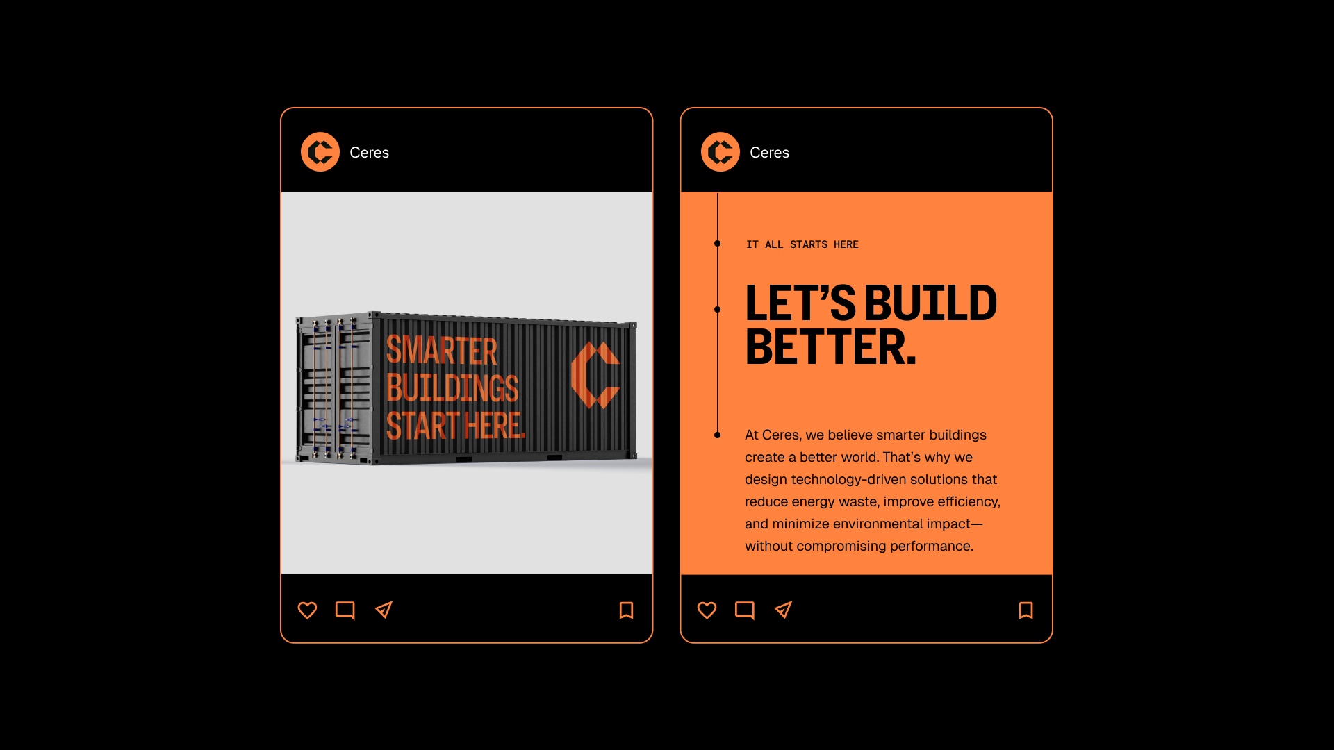
We worked with Ceres to craft a simple brand identity that reflected the hard-working, technology-driven brand and its commitment to excellence. The C symbol is created by overlapping hexagonal shapes the represent stacked technological solutions. The colors and typography represent the blue-color, hard hat culture of the brand and its leadership.